To read more about this design and its conceptual approach, visit https://www.theloop.com.au/tanyaambour.

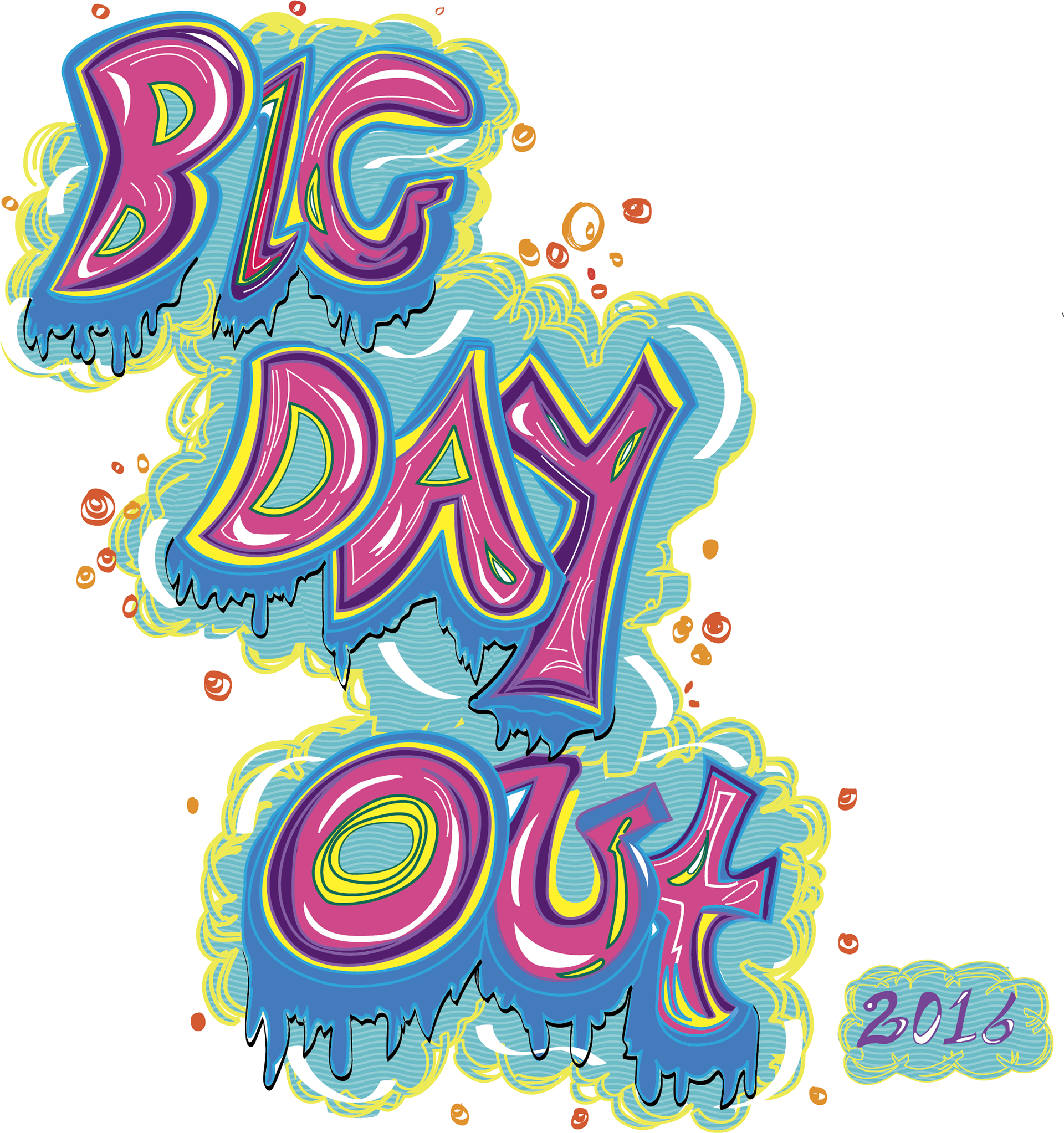
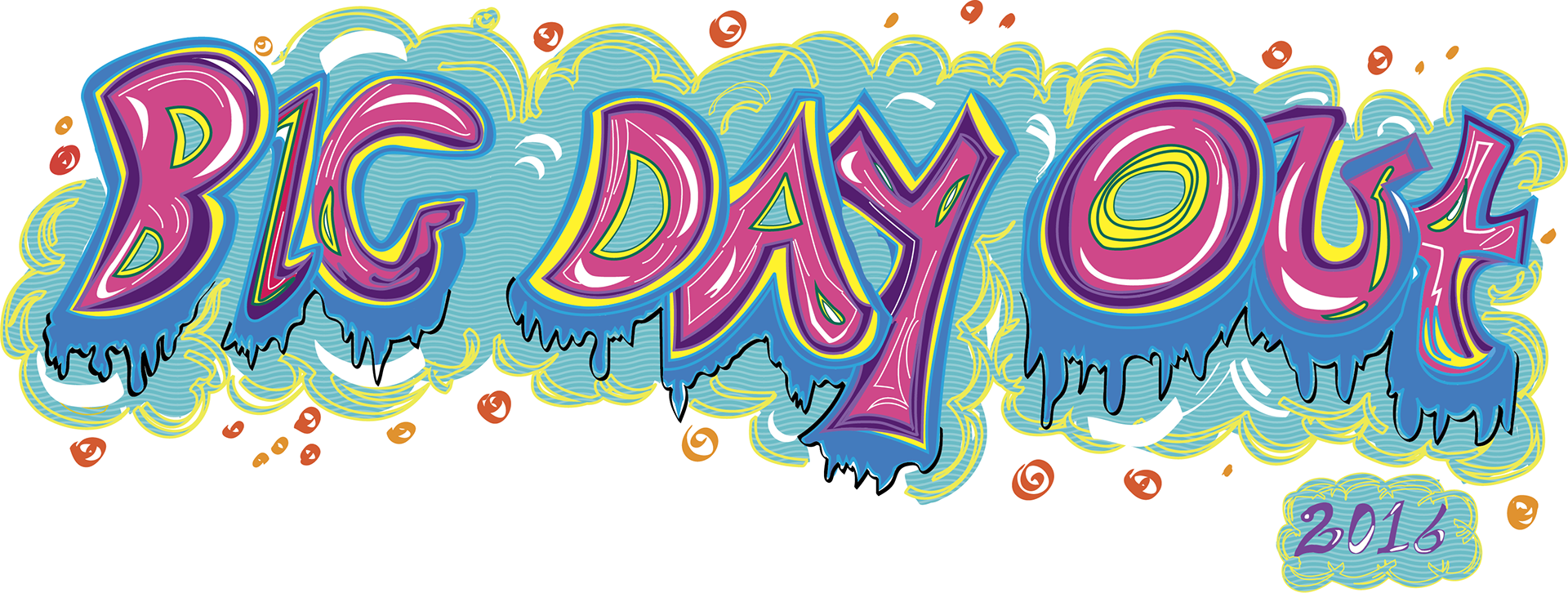
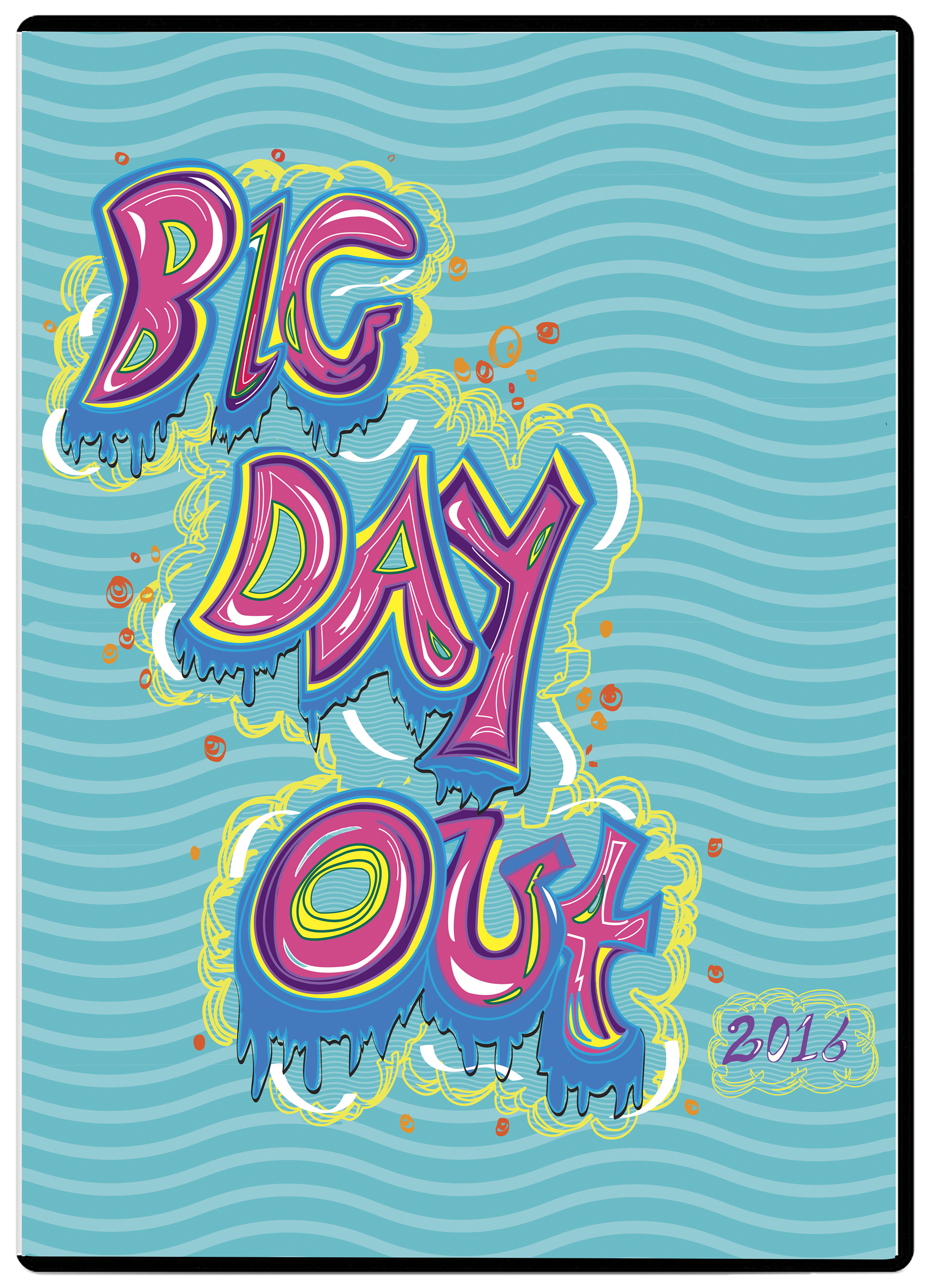
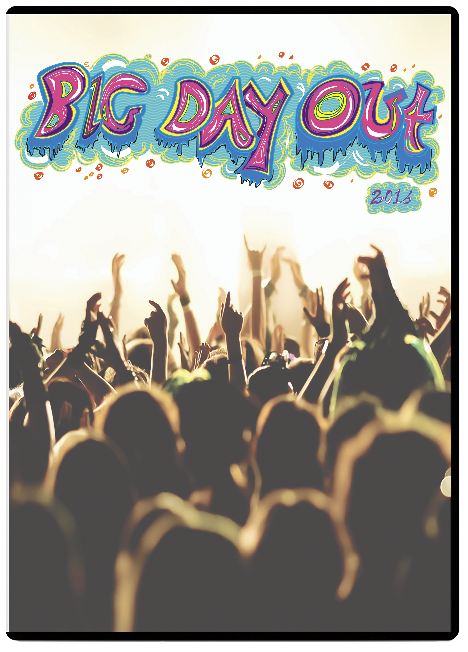
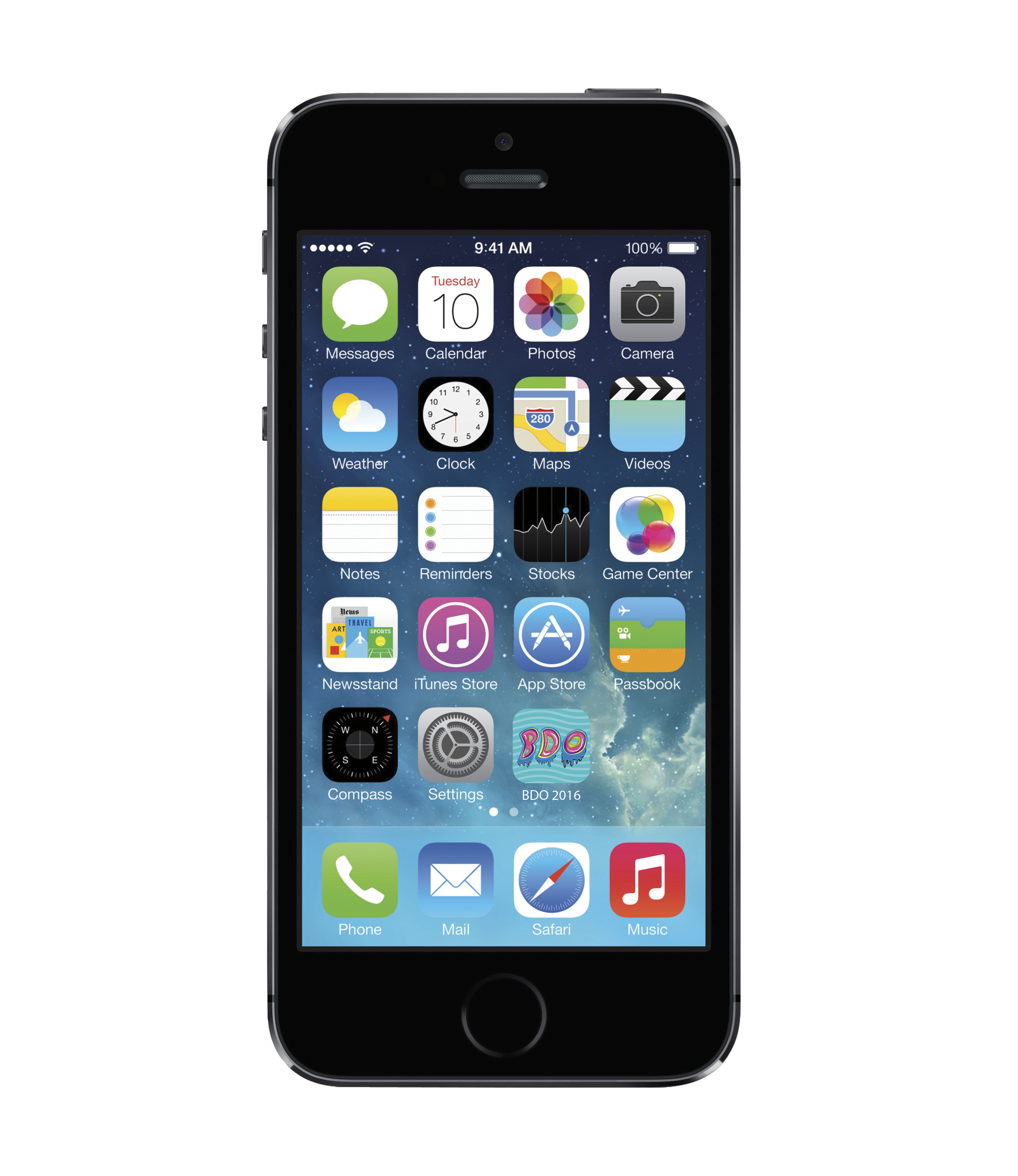
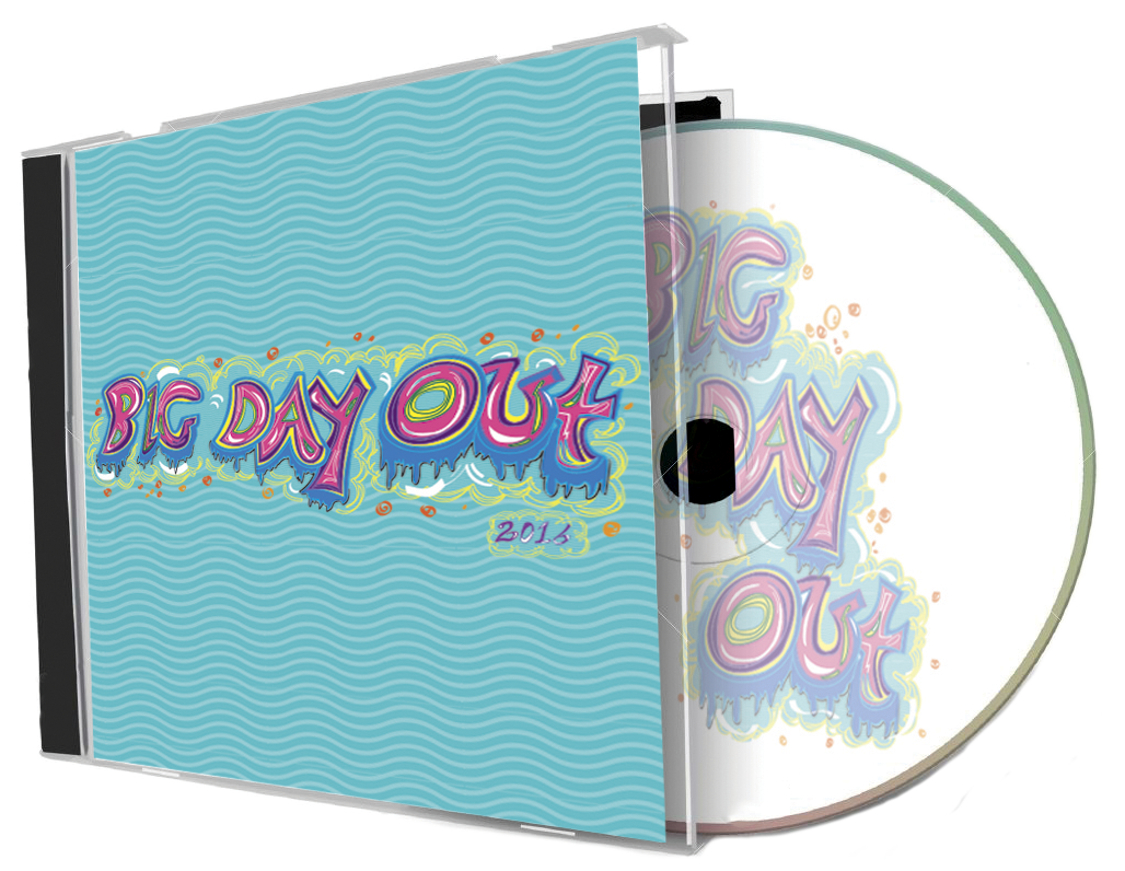
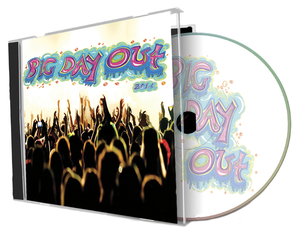
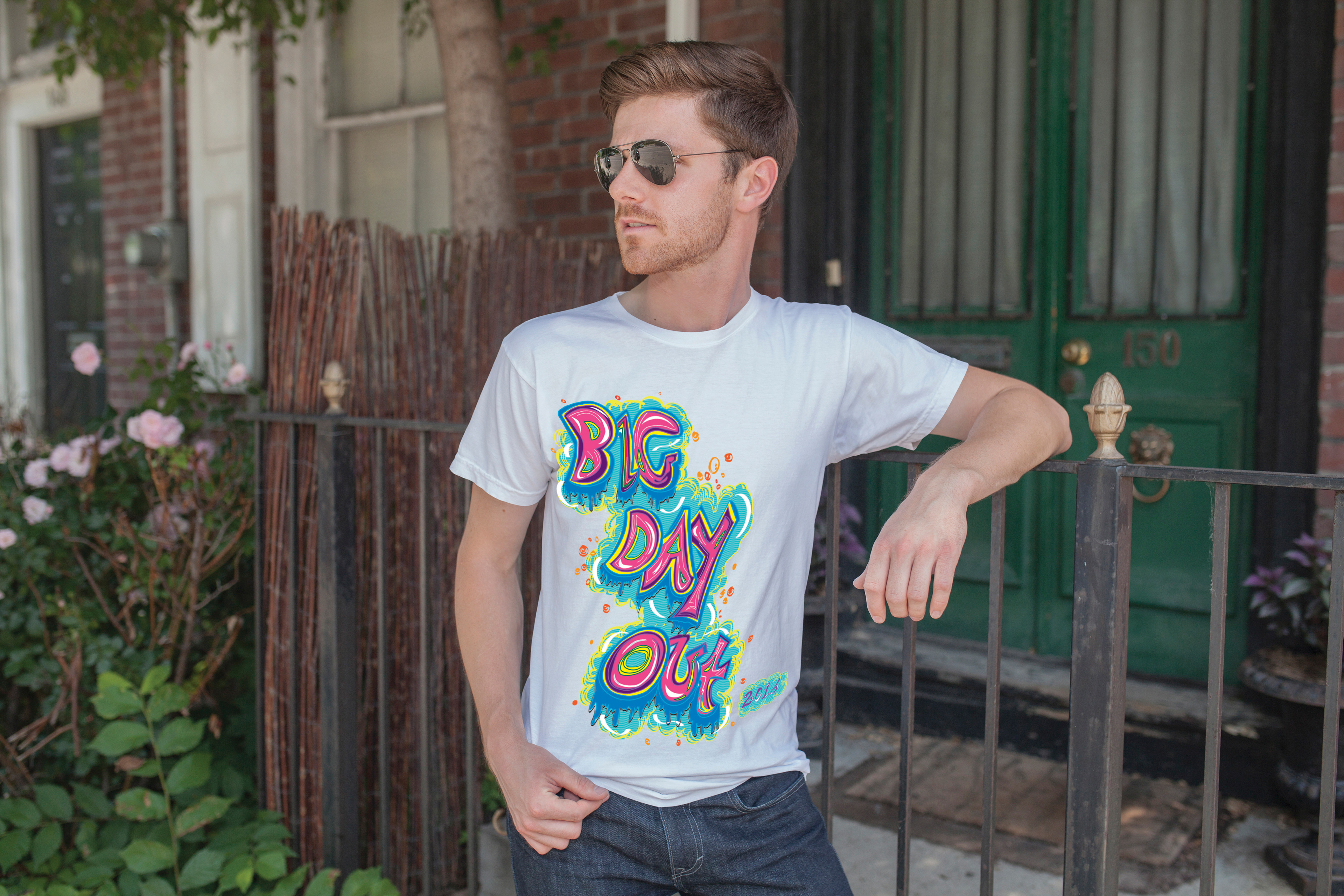
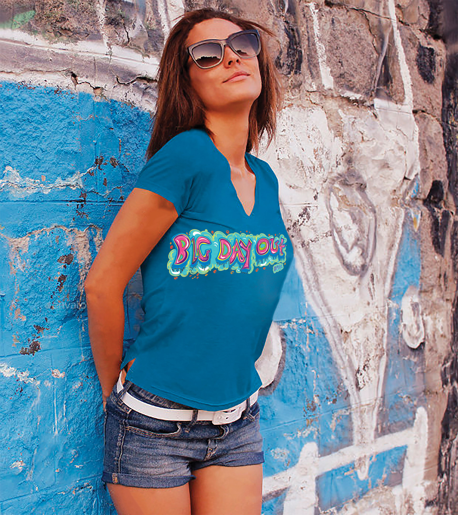
As part of a College project, a new brand identity and collateral was designed for the Summer 2016 Big Day Out Music Festival. Each year the festival brands itself with a completely new identity making it very unique to most other clients. The brief asked for something different and are interested in breaking some of the rules that have been established by previous designs. The logo was needed in a number of formats (vertical and horizontal) and how the design applies to CD and DVD covers, an iPhone application and t-shirts. My brand identity design overall displays a vibrant, playful interplay that would attract the demographic of the youth. I chose to represent the event in big, bright and bold colours that will immediately capture the attention of young teenagers. In order to heighten and reassure this captivation, it was essential to employ a typeface that not only symbolises the true meaning of the event, but also one that will most have a connection with young people. Therefore, a graffiti/hip hop typeface, that has been hand-rendered, was the approach I pursued. The colour palette and the hand-rendered typeface seem to make a successful branding of the portrayal of the event as they cohesively bring life to the design to effectively reiterate the fun atmosphere one would expect to experience at such an occasion, thus making it an ideal identity. This design is unique and different to previous Big Day Out logos, allowing the festival to challenge the boundaries of design and take risks by stepping away from the original branding of simple typefaces enhanced with supporting illustrations. Instead, it purely relies on the artistic typography to significantly represent the identity and branding for the festival.