

To read more about this design and its conceptual approach, visit https://www.theloop.com.au/tanyaambour.

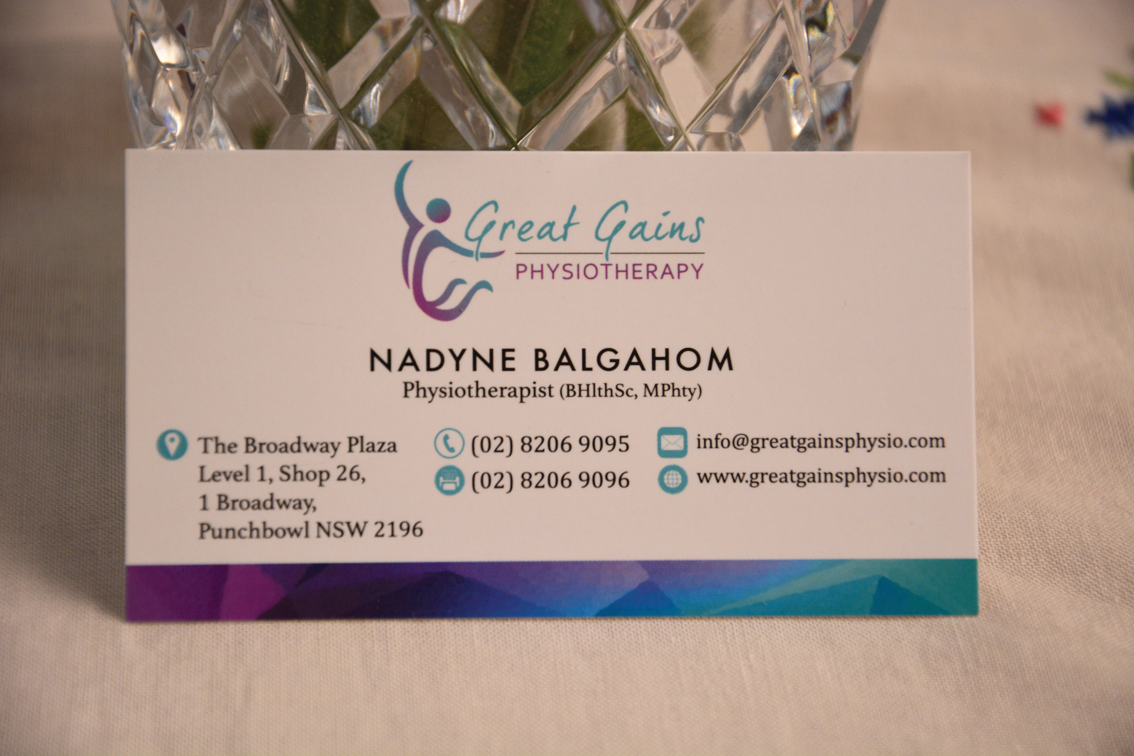
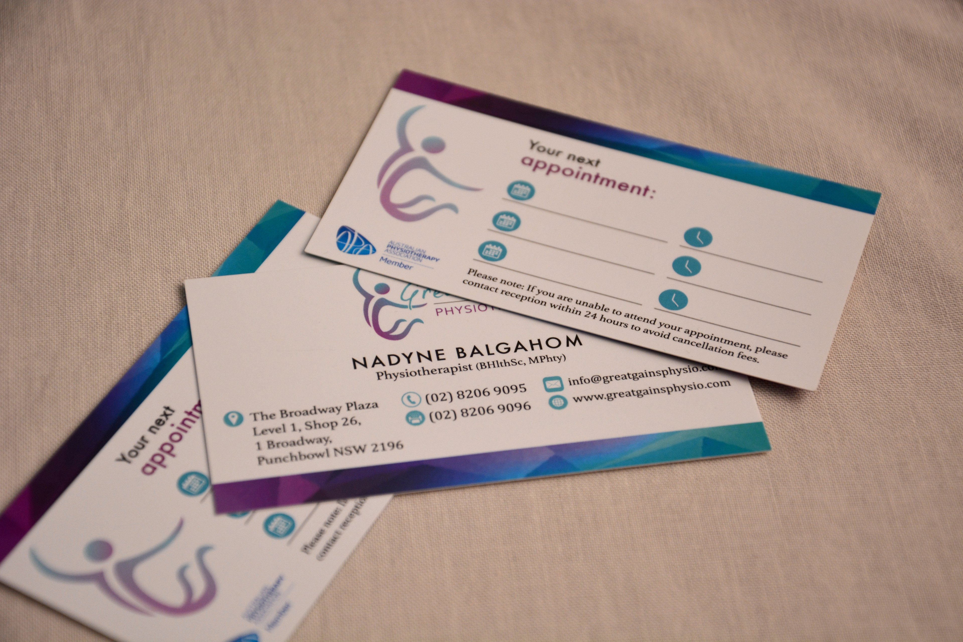
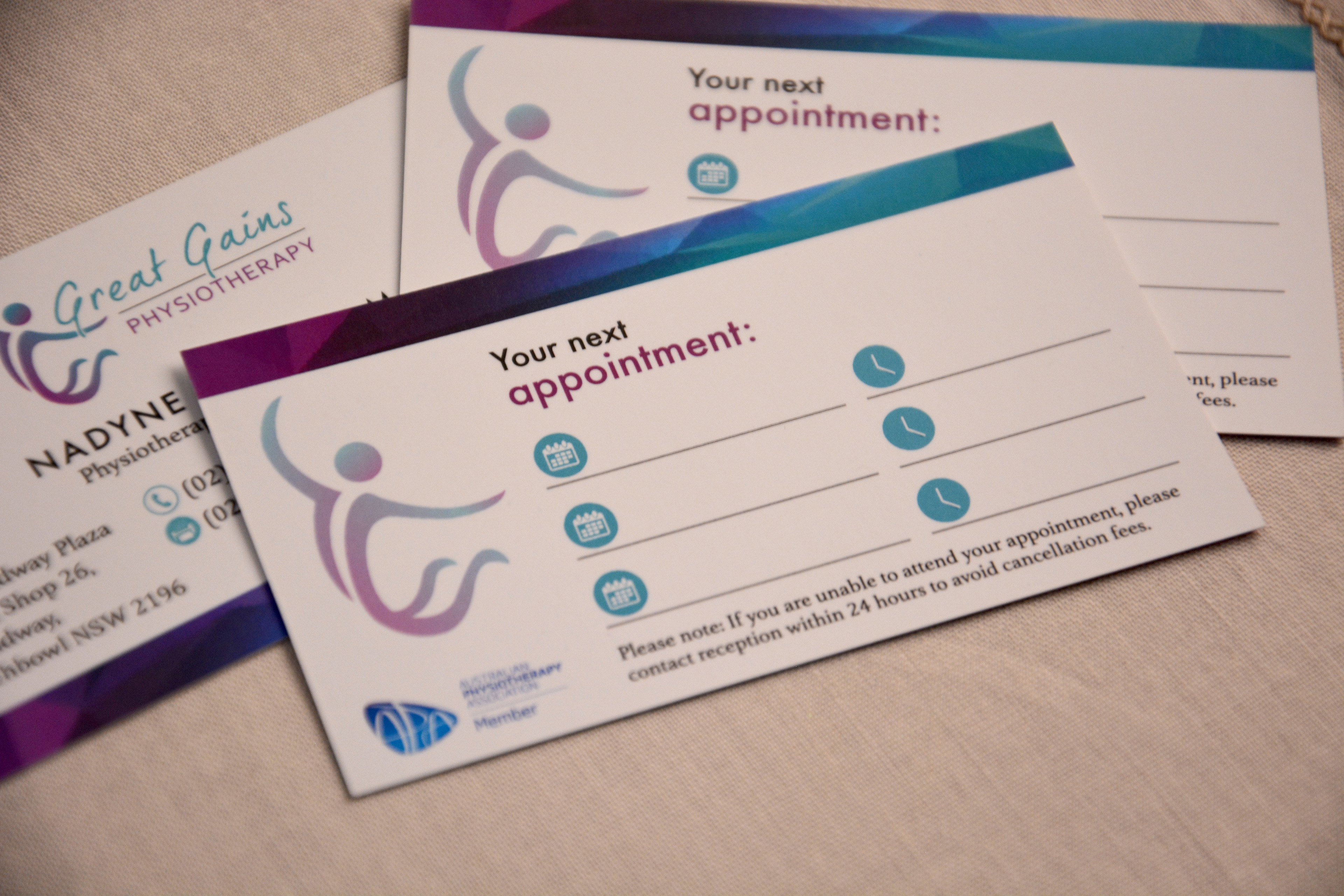
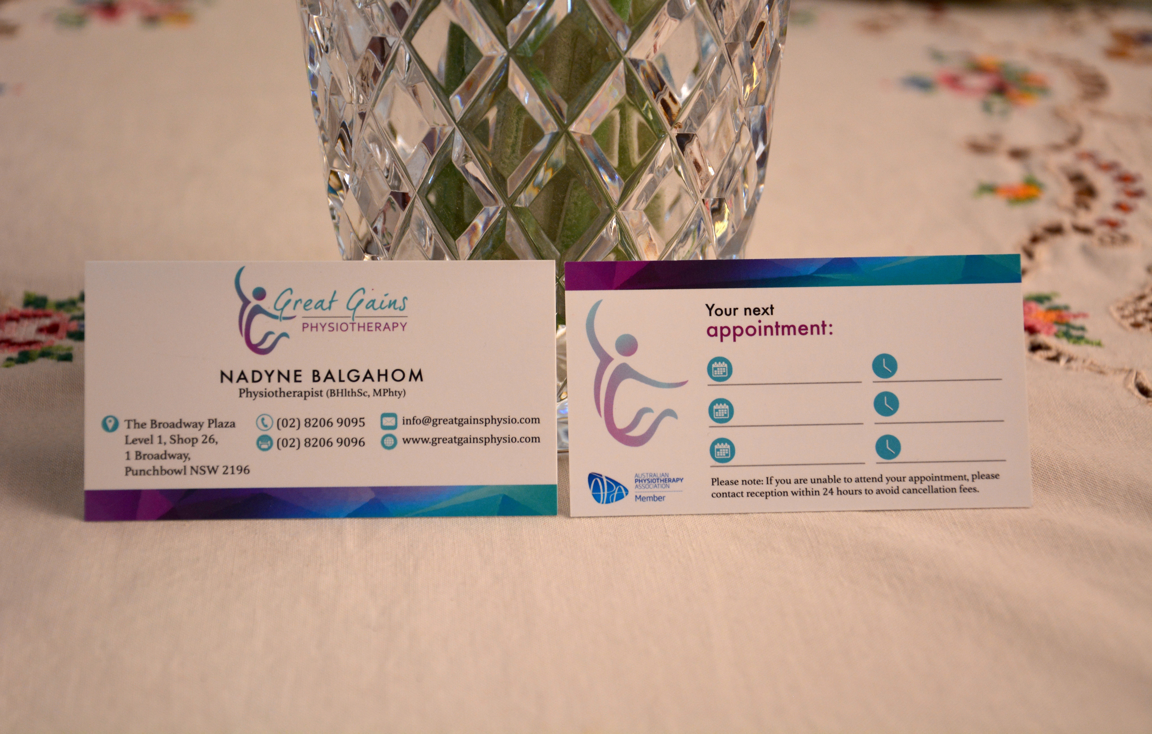
A physiotherapist needed a logo and a business card designed for her new and developing business, “Great Gains Physiotherapy”. She knew exactly what she wanted; the intended look of the logo and the corresponding colour choice. She requested a logo design that reflected positivity and improvements for life. A blend of turquoise and purple were her choices of colour for her brand, which have been consistently implemented throughout the business card design as well. Overall, the logo is simplistic, engaging and memorable that distinctly captures the positivity of her business via the image and the typefaces chosen. The colours utilised are harmonious-looking, emitting a soothing essence to the public audience in which they can expect to experience as a result of a physiotherapy session. The business card is modern and simple, yet maintains a professional outlook with a mixture of a hospitable appeal. The front and back of the card appears welcoming and pleasing to the eye, entailing the desired optimism and vitality that convincingly represents her brand identity.