To read more about this design and its conceptual approach, visit https://www.theloop.com.au/tanyaambour.

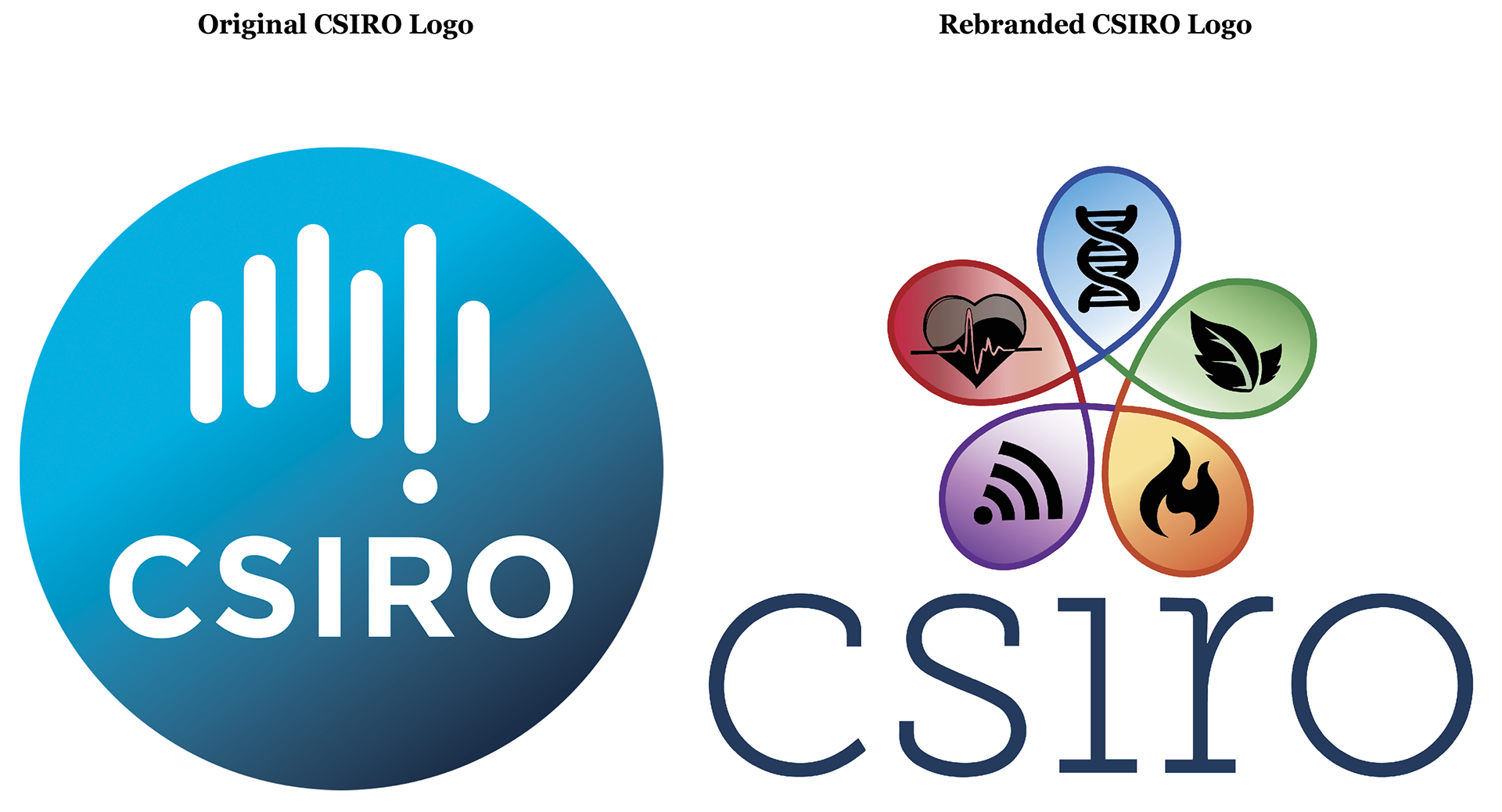
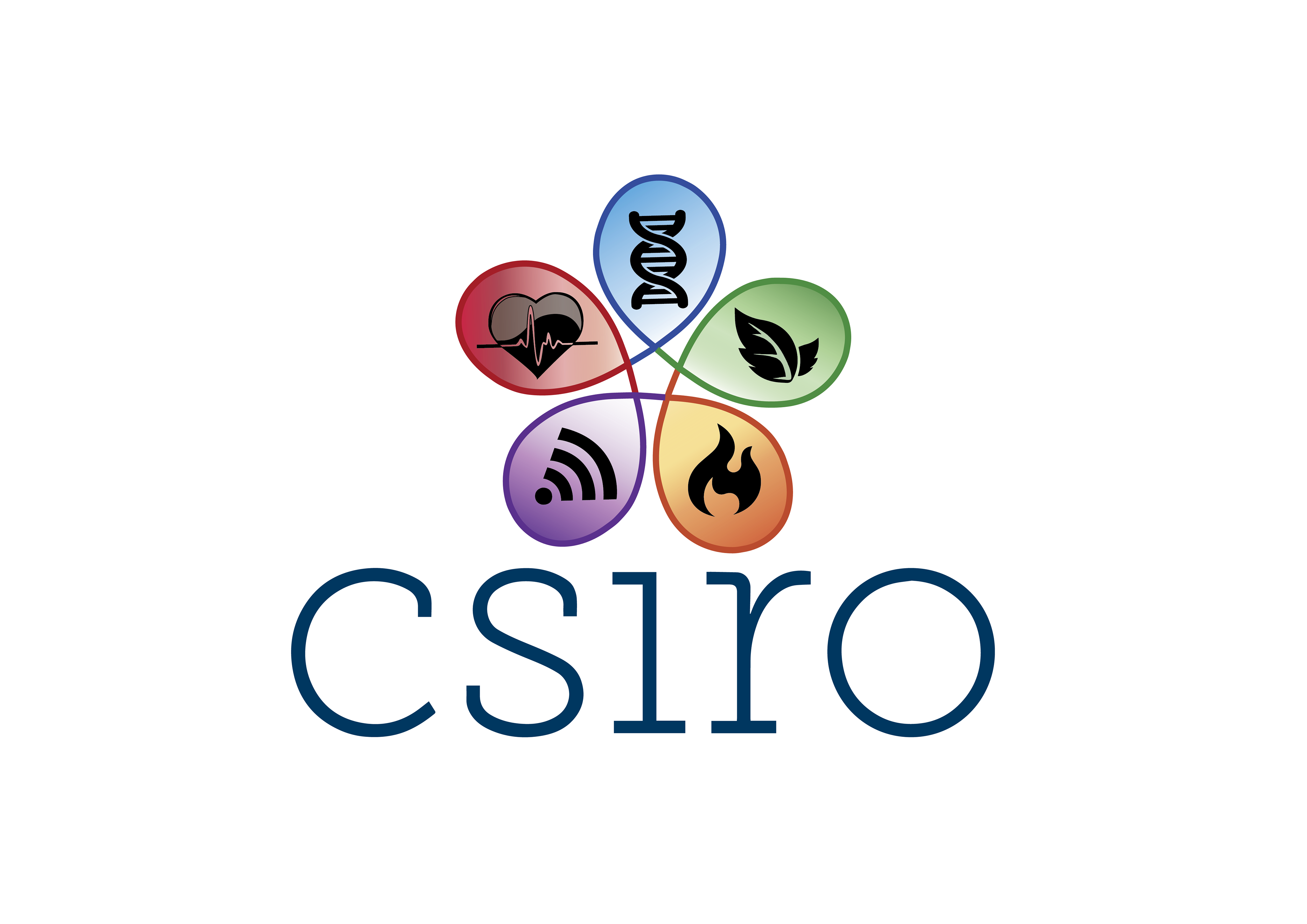
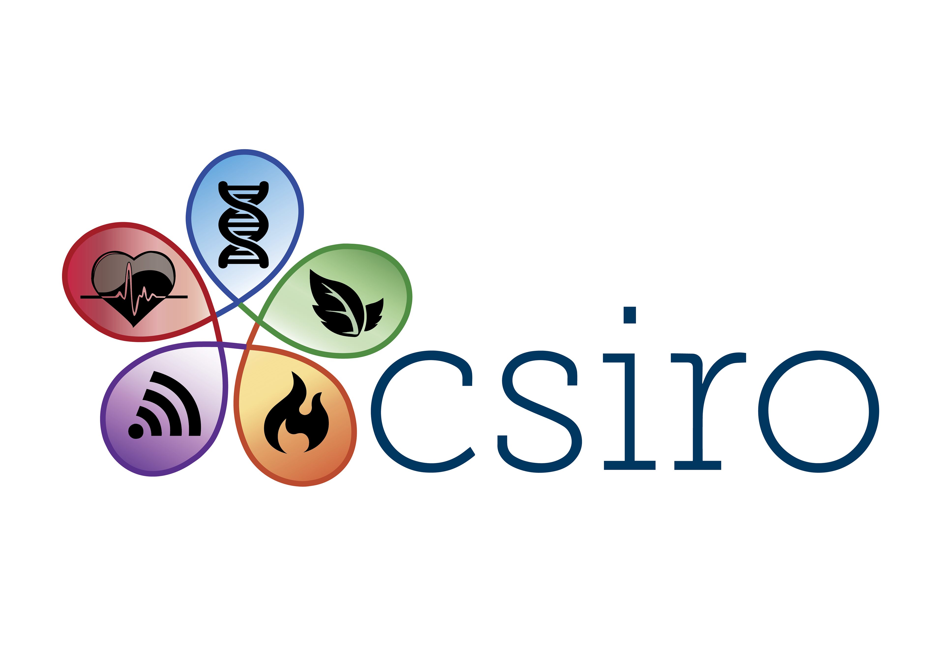
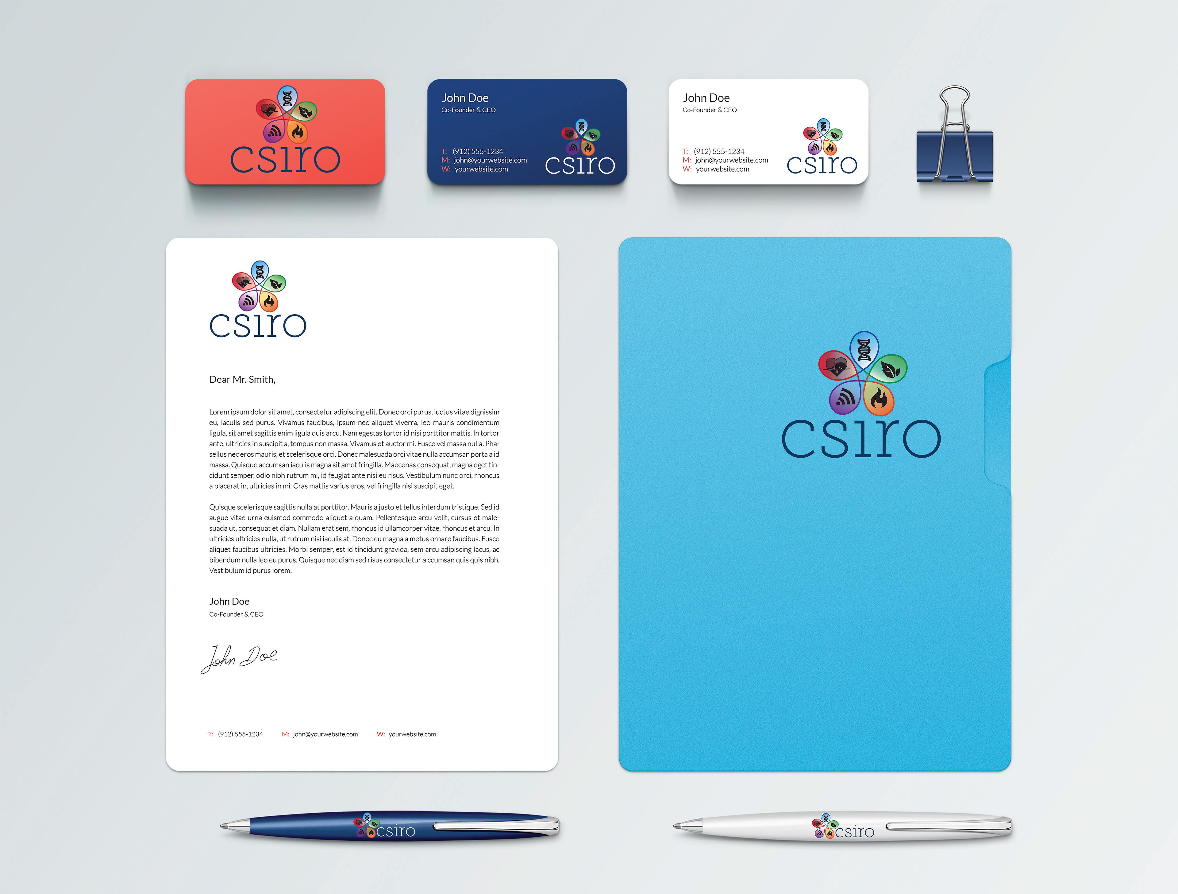
As part of a College project, a rebrand identity was needed to be produced for the scientific and industrial research organisation, CSIRO. A redesigned logo had to be made in response to the problem CSIRO was experiencing. The new, refreshed logo that CSIRO had undertaken was supposed to represent a more modern approach, however, it backfired when the identity resulted in looking very similar to another well-known brand’s logo, CISCO. They needed to move quickly to divert attention away from the slip up and back to the original needs of the refresh: more modern, more approachable and less boring. The company needed, instead, a rebrand and present a new face to the public due to this circumstance. As Australia’s national science agency and one of the largest and most diverse research agencies in the world, it was immensely significant for me to uphold this thematic concern in the overall visual identity of CSIRO. I found myself to linking closely to the scientific aspect of the organisation and constructing imageries revolving around the notion of scientific representations and matter. The primary focus for my rebrand concept is communicating the importance of science as a fundamentally unique basis for growing and "shaping the future". I attempted to represent their ongoing innovation by forming a visually iconic scientific imagery in its organic essence with various underlying meanings in relation to the people, planet, environment, partnerships and ultimately, "shaping the future" for a better tomorrow. Fundamentally, my rebranded logo showcases an aesthetically pleasing appeal and a modern, approachable essence in order to convey the nature of CSIRO’s organisation as a professional scientific entity. The logo exemplifies the profundity of the company’s core value of the importance of research in various distinctive areas, and how this compassionate responsibility delivers a harmonious connection between humanity and its environment.